top of page

Always
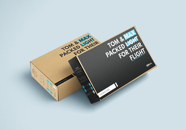
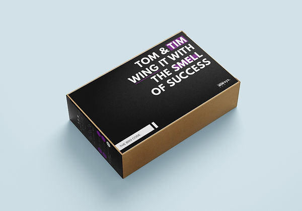
This project was inspired by creating packaging that was accessible to all people who purchase sanitary pads. The concept was called "The bro code" and included modernised packaging design and cryptic copy. The mentions of heavy and light referred to flow, any reference to planes or flying meant the sanitary pad has wings and mentions of smell refers to scented sanitary pads. This concept aimed to make it easy for women to communicate what they need to be bought with partners or family. The concept was translated into a multimedia concept and inspirational posters.
Packaging

Multimedia


posters


bottom of page